The way you measure your projects' progress depends on a lot of factors — your industry, your team, your chosen methodology, and lots more. There are plenty of types of charts to choose from to display your progress as you go, including Gantt charts, PERT charts, Pareto charts, flowcharts, and many more — but if you and your team like to go Agile, a burnup chart may be the best fit.
A burnup chart is a visual diagram commonly used on Agile projects to help measure progress. Agile burnup charts allow project managers and teams to quickly see how their workload is progressing and whether project completion is on schedule.
But what's the meaning of this Agile buzzword? In this article, we’ll discuss the purpose and benefits of a burnup chart, how to read and create one, and the difference between a burnup and burndown chart.
Key takeaways:
- What is a burnup chart? A burnup chart is a visual tool in Agile project management that illustrates project progress by tracking total planned work against completed work over time.
- How does a burnup chart differ from a burndown chart? A burnup chart shows completed work rising while a burndown chart shows remaining work decreasing; this highlights accomplishments better in Agile contexts.
- What are the key benefits of using a burnup chart? It helps monitor team efficiency, forecast project timelines, and manage scope changes effectively.
- How do you read a burnup chart? Review the project work lines: the total planned work, actual work completed, and observe any changes in the blue and black lines to assess project status.
- How can you create a burnup chart? Draw the axes for time and planned work, plot the total work line, then mark actual work points after each sprint to visualize progress.
Introducing the Agile burnup chart
A burnup chart is a graph that shows project progress over time. There are two main lines shown on the chart: one for the total project work planned, and the other for tracking the work completed to date.
By comparing the work your team has accomplished so far with the total amount of work planned, you can understand how efficiently they’re working and better estimate how long it will take to complete the work remaining.
Burnup charts are an essential part of the Agile methodology, as they keep track of what has been accomplished across each sprint. In this way, they are also useful for Scrum teams, as the Scrum master can review their burnup chart to analyse where improvements can be made, and cover these in daily meetings with the rest of the team.
Burnup vs. burndown chart — What is the difference?
A burnup chart and a burndown chart are both popular project management tools for visually tracking work completed over time. But, there are key differences between the two charts.
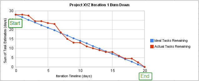
First, a burndown chart starts with the total amount of work and then graphs the amount remaining over time. As time progresses, the amount of work to be done lessens, and the line decreases toward the right.
A burnup chart tracks the amount of work to be completed as one straight line across the top of the graph (unless a scope change occurs). A second line is then used to track work completed, starting at zero and increasing to the right as more tasks are finished.
Because of this difference, a burndown chart is great at emphasizing what’s left to be completed, but a burnup chart is better at illustrating the work that’s been accomplished.
For example, imagine your Agile team had 50 story points (SPs) left to complete. (A story point is a unit of measurement that Scrum teams assign to tasks or stories to indicate how much effort they think will be required.) Then, a change occurred, which added 10 more SPs. Let’s also assume that, during your current sprint, your team managed to get through 15 SPs.
On a burndown chart, before your sprint, it would show 50 SPs remaining, and after your sprint, it would show 45 SPs remaining (50 + 10 - 15). The amount remaining is correct, but if someone wasn’t aware of the scope change, they could look at this graph and assume you had a really unproductive sprint and your team only completed 5 SPs instead of the 15 they actually did.
With a burnup chart, you’d easily see the 10 SP increase in the line illustrating overall work to be completed, and see the 15 SP increase in the line tracking work accomplished.
How do you read a burnup chart?
Here’s an example of a burnup chart:
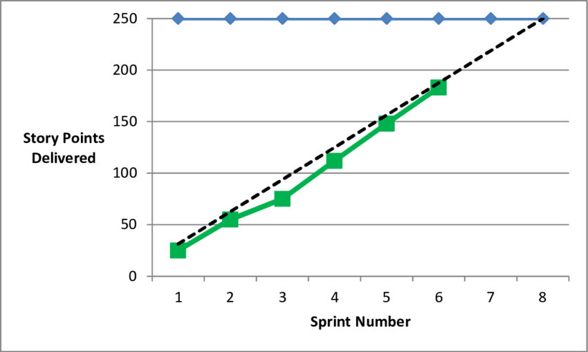
Along the y-axis is the number of story points delivered or the amount of work to be completed. Across the x-axis is the sprint number or time period.
The blue line across the top shows the total planned number of story points that will be delivered by the end of the project.
The dotted black line illustrates the planned completion of story points. In this example, that’s roughly 31 SPs per sprint (250/8).
The green line is reporting the actual number of story points completed. You can see that for sprints 1 and 2, actual and planned were essentially the same. Then, during sprint 3, less work was delivered than expected, but the team caught back up by sprint 5.
The green line only goes to sprint 6, indicating that the final two sprints haven’t been completed yet.
Some key things to watch out for when reading a burnup chart are:
- If the blue line changes, you know work has been added or removed from the project.
- If the black line changes, a change has been made to the baseline plan for how much work will be completed in each sprint.
- If the green line is beneath the black line, you’re behind schedule.
- If the green line is above the black line, you’re ahead of schedule.
What are the benefits of a burnup chart?
A sprint burnup chart helps your Agile team monitor how efficient they are from one sprint to the next. It also helps everyone keep track of how much work is left and whether you can expect to complete the project on time based on your progress rate so far.
If your team was completing 20 SPs per sprint and now suddenly they only completed 10 SPs, your burnup chart will highlight that change. This makes it easier for you to spot differences and investigate them to see if a bottleneck or issue is slowing your team.
During a project, you can extend the actual work completed line to help predict when the project will end. This can help you estimate project length. It also allows you to be proactive about monitoring progress and discussing what you can do if it looks like the project isn’t going to finish on schedule.
Plus, a burnup chart monitors your overall scope and how that impacts your project length. What does scope mean in project management? It's essentially all of the requirements and objectives that a project needs to be a success. Your burnup chart is an easy way to show your client and other stakeholders how much longer the project should take if they want additional work added.
How do you create a burnup chart?
First, draw your two axes with your time periods or sprint numbers across the bottom (x-axis) and your number of story points or planned work up the left side (y-axis). Next, find the number of total work planned and draw a line straight across the top.
Now it’s time to plot your trend line for planned work over time. The easiest way to do this is to plot your start point (0,0) and your end point (where the last planned sprint intersects with the total volume of planned work). Then connect the two points with a straight line.
As work progresses, you can plot the actual work level completed at the end of each sprint or reporting period. Connecting these dots will create your line showing actual work.
While you can create an Agile burnup chart using a pencil, ruler, and piece of paper, it makes it challenging to quickly edit it and share it with your team.
With Wrike Analyze, you can create a sprint board that highlights all of the essential project information you need to see — including burnup and burndown charts, percentage of work completed, the total number of hours spent, and more.
Sign up today for a free trial of Wrike’s project management software to test out our easy-to-use sprint board template, as well as a multitude of other essential Agile features — including real-time reports, Scrum dashboards, and Kanban boards.