Wrike has always been a pioneer of robust technology. And we’ve continued down the path of providing technology that evolves and is scalable, but now with the most modern and user-friendly experience on the market. Wrike Lightspeed is Wrike’s way of enabling customers to maximize efficiency so they can do the best work of their lives.
Wrike Lightspeed is the fastest way to productivity and the only work management solution built without tradeoffs. Wrike’s ease of use, scalability, and versatility can be applied across customers’ entire work management process. We equip them with all the tools they need — including multiple work views — to manage daily tasks in a way that suits their own use cases.
Our platform enables teams to work as one, their own way, making Wrike the most powerful solution on the market for every team and every business.
Let’s take a look at how the new Wrike Lightspeed platform can change the way you work and bring joy to your daily routine.
New user-friendly interface
Have you ever used a tool that took more time to learn than to actually finish a project? The new, user-friendly interface of Wrike Lightspeed lets you cut the clutter and enjoy the benefits of truly intuitive design.
Wrike helps your team work faster and more efficiently, displaying only the most essential elements, but allowing you to introduce more complex functionality as you’re ready to scale.
With our fresh, fun design, working on every task is a pleasure.
New views
Switch from view to view based on who is looking and what information they need. You share the metrics and progress with your team leader via Chart view, your team members look at tasks that need to be executed in a familiar spreadsheet style, and you can manage and schedule projects with the new Calendar view.
Any team using an Agile framework can view projects and action items in our Kanban-style Board view.
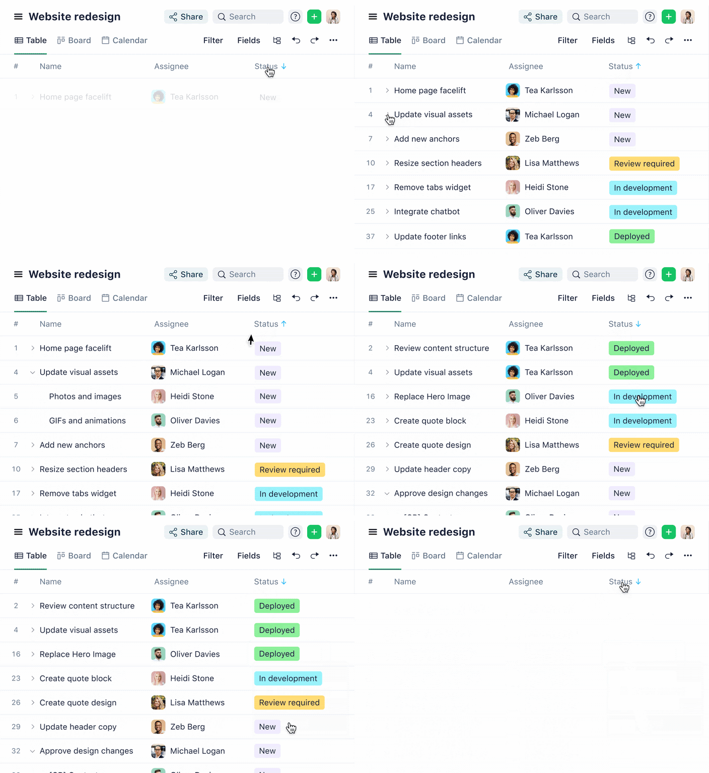
New Table view
The new Table view enables work management in a familiar spreadsheet-like format. Create and manage work items, and expand and collapse to the next level of subitems. Navigate within the table with an item open in the right panel (i.e., a task or project) and easily switch to another task in one click. This new Table view allows users to load massive projects and folders quickly — ensuring great scalability for enterprises and bigger initiatives.
What’s more, Table view now enables mass actions for tasks, projects, folders, and item types. This means users can save valuable time by multiple work items in one go. Mass actions include workflow status changes, multiple item deletion, rescheduling, location changes, and work assignment/reassignment.
And one more thing! You can now add conditional formatting and color-coding to regular custom fields, not just calculated ones. This includes percentage, currency, date, and duration. Give it a go and let us know what you think!
New Board view
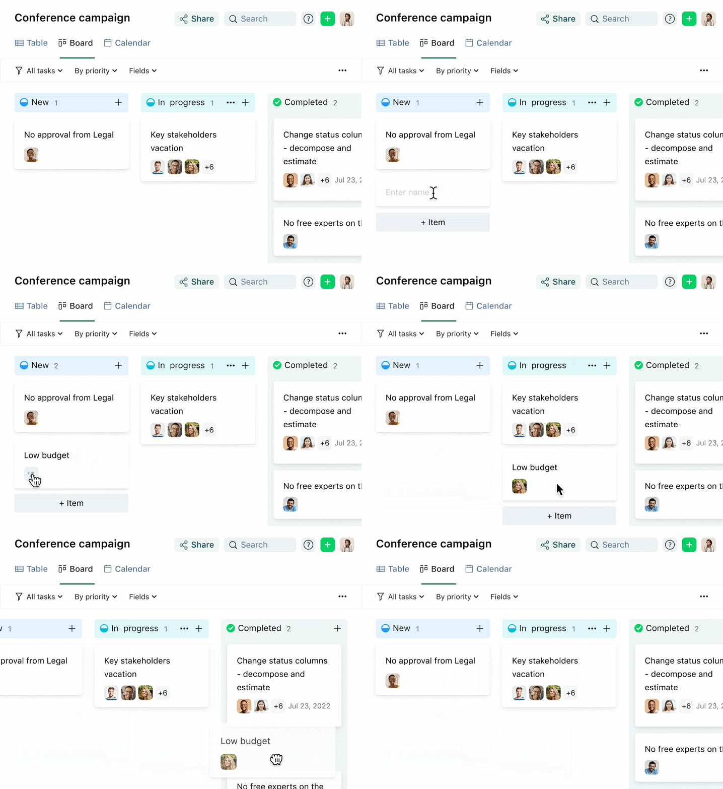
The reimagined Board view enables you to view all the tasks in a project, folder, or space in a simple layout, grouped by the status of the item. Using the updated view, you now can view subtasks, rearrange the order of the columns, modify workflows in-flight, and select which fields to display the information you need.
Additionally, you can now also group by assignee. This helps managers track individual assignments and balance the workload across the entire team. You can also drag and drop items to reassign work in an instant.
New Calendar view
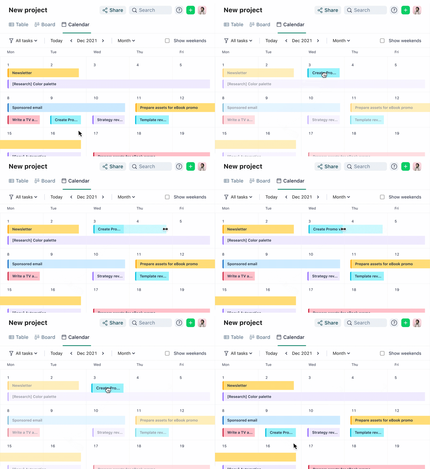
With the brand new Calendar view, you can now quickly display work items — such as tasks, projects, or custom item types, like marketing campaigns or product releases — on a timeline to keep track of what needs to be worked on and when.
It gives a weekly, monthly, quarterly, or yearly overview to help you make decisions on what needs to be added or rescheduled in current projects, track the progress of your current work, and plan for the future.
New Gantt view
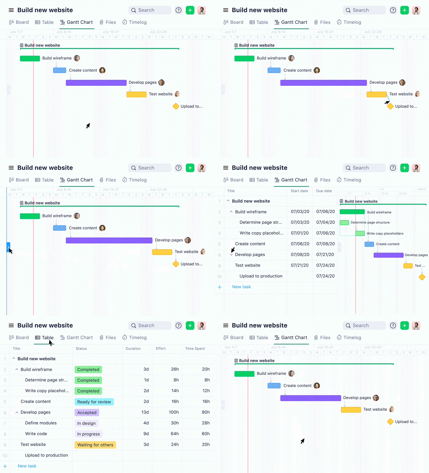
Never miss a deadline with the best-in-class Gantt view. Create your task list, add assignees and dates, then see how updates made on one task impact the rest of your timeline — all in real time. Build your project timeline and adjust tasks, while seeing how the changes impact the rest of your timeline across multiple workstreams.
With this Gantt chart, you can share an interactive snapshot view with external users. The revamped Gantt view allows you to add dependencies, spot potential bottlenecks, take corrective action in advance, and prevent delays to deliver work on time.
New Chart view
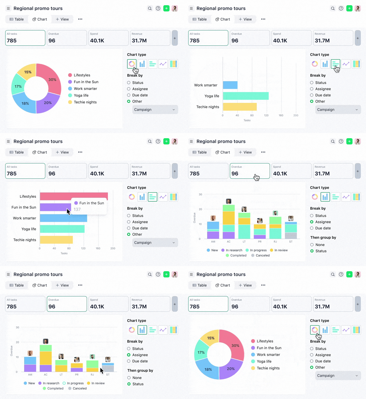
Get a snapshot of project progress in seconds with the brand new Chart view (formerly known as Analytics view). This interactive, self-service reporting tool provides a bird’s-eye view of task status, allowing users to dig for details with easy-to-use filtering and data breakdowns.
With Chart view, you can slice and dice data across any type of work — be it tasks, projects, or custom item types.
The best part? You don’t need any advanced skills, permissions, or admin involvement — it’s democratized for any user across any Wrike subscription type.
New Item view
Welcome to your all-in-one view! The new Item view delivers a visually fresh and better-organized user interface, providing a consistent look and feel for every type of work. We’ve simplified the layout and increased in-text collaboration for tasks, projects, folders, and custom item types.
Users can now tweak and customize our Item view to remove or collapse features and fields they don’t use — making it easier to get work done.
We also have a new and improved experience for custom fields! No more cluttered lists — just click the button to reveal your custom fields and search for a specific one. All inherited fields can be found below — simply expand to see them all.
And once you configure the Item view to fit your needs, you can apply those changes across your entire account. With this update, users will get the same experience across any type of work item.
New simplified navigation
The new Header and left-hand Sidebar with a modern and intuitive design make it even easier for users to navigate Wrike. It might seem like a small change, but we’ve decluttered and compacted the layouts for both the Header and the Sidebar to make more space for what matters most: the user’s content and work.
Plus, now you can customize the tools and folders you see in the Sidebar in just a few clicks. With our new Header and Sidebar, you get a simpler Wrike experience since you can more easily focus on the task at hand.

Improved performance
Wrike Lightspeed is configurable, easy to use, and scalable, enabling customers to reach new levels of productivity and even faster execution across all their business processes. This is reflected by every solution launched on our platform, which creates improved performance and the best work experience for all.
Why choose ease of use over functionality when you can have it all?
Wrike Lightspeed is the only platform that doesn’t require customers to make tradeoffs, enabling teams, departments, and whole companies to work as one and simultaneously provide an ability to customize individual work that matches each team’s unique needs.
Think you’re ready to transform the way you work? Start with a free trial of Wrike today and begin your journey with Wrike Lightspeed.


