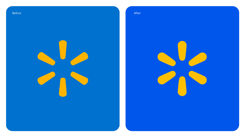
I don’t want to stand on the sidelines of the social media buzz around Walmart’s rebranding. Many are claiming the company is spending significant resources on subtle changes. This conversation resonates with me — not only because, in my experience, the most impactful branding work often goes unnoticed at first glance but makes a profound difference over time.
It also caught my attention because, as a bit of insider news, we at Wrike are currently refreshing our own brand. While our efforts are much more modest, they’re no less intentional. In my view, the criticisms of Walmart’s refresh are misplaced, and here are three reasons why.

First: The subtlety is a strength
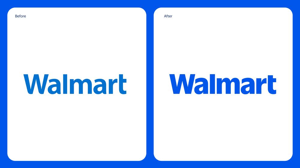
The fact that most people can’t spot a big difference between the old Walmart logo and the one recently introduced during the brand refresh is actually a positive. For a brand of Walmart’s scale, recognizability is paramount. Radical changes could risk alienating its audience, so it has opted for subtle tweaks that don’t look dramatic but work effectively on an emotional level.
You’ve likely experienced this yourself: you open an app, notice it feels better somehow, but you can’t quite put your finger on why. That’s the power of refined design adjustments — they subtly shift your emotional perception.

Let’s take a closer look at the font of the new Walmart logo: the removed rounded edges, increased contrast between primary and secondary strokes, altered shapes of the letter counters, and vertical stroke cuts — all these changes make the font feel more contemporary and solid, adding greater character from my perspective.
At the same time, it pays homage to history, as the font design is inspired by the lettering on the classic trucker hat worn by the company’s founder. I’d suggest that the meaning of the Walmart logo is: “We’re like you; we represent the people you see every day.”
Similarly, the color changes, if tested blindly — evaluating the design without brand cues — would, I’m confident, lead people to perceive the refreshed brand as more modern, confident, and appealing, all while preserving the brand’s familiarity.
The Walmart logo evolution seems perfectly timed, reflecting a focus on engaging a growing demographic of younger customers.
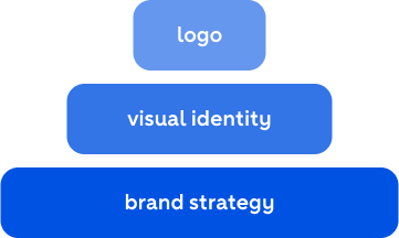
Second: Visual identity is more than just a logo
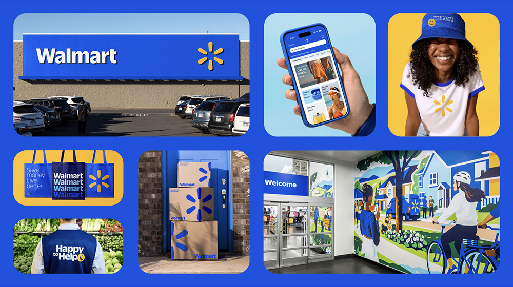
Visual identity extends far beyond the logo. A refresh affects every layer of communication, from typography and color palettes to layouts, graphic styles, illustrations, iconography, and photography. These updates must be meticulously documented in brand guidelines to ensure that any marketing team, anywhere in the world, can consistently create materials that align with the brand’s identity.
Aldi’s viral post comparing the old and new Walmart logos side by side may have been clever, but it’s misleading. To properly evaluate a refresh, you need to examine the entire communication system — not just the logo. And when you do, the difference becomes substantial.

Third: Branding is more than just visual identity
Even the entire visual style is just the visible tip of the iceberg. Beneath it lie deeper layers of brand strategy, many of which remain confidential: insights into the target audience, positioning, pricing strategies, and loyalty programs; tone of voice for communications; merchandising standards; associate appearance policies; customer interaction protocols for in-store staff; and corporate culture designed to enhance associate engagement. These efforts have a profound impact on the brand’s relationship with customers, vendors, and staff, though the results take time to become apparent.

Walmart branding is officially described as a “brand refresh” with an updated look and feel, but the details of deeper strategic changes remain undisclosed.
I can see how much effort Walmart’s branding team invested before rolling out changes across every touchpoint. For Walmart, with over 10,000 stores, this is a monumental undertaking that demands precision to minimize risks. Ultimately, only time will tell if Walmart’s brand refresh achieves its goals but, to me, it seems like a very thoughtful and thorough effort, carried out with great care for brand awareness and respect for the company’s legacy.
Want to geek out over brand development? Reach out to me on LinkedIn.


